If there is one thing that you need to do to improve your return on investment today what would it be? Would it be the usage of landing pages on your site?
If you have invested your valuable time in online advertising then you will probably come across the term “landing page” almost every now and then.
But what the hell is this landing page? And what makes it different from other pages, why so much importance is given to this landing page?
In this article, I will to take you on a tour of landing pages, the effectiveness of a landing page, and also some landing page builders that can help you to create one and much more.
Beware this article is a fairly comprehensive intro to landing pages, so it is not the quickest one to read! But I am sure by the time you have walked your way through this content you will have a solid understanding of landing pages and how to use them and improve your online marketing.
What is a Landing Page?
Landing Page is nothing but the very first page that you will probably land on after you click on a link. A landing page can be anything, it can be your homepage, a blog, a lead-generation page, or a product page, or a simple standalone page.
Landing Page is generally designed to increase your conversion rates in order to reach your business goals or marketing campaigns. It should offer something valuable to your visitor, maybe an ebook or a free guide by making your visitors fill out a form with the much-needed contact details.
However, there is too much confusion among people when it comes to a landing page v/s a homepage or any other page that your readers or visitors come across via search engines.
All of this comes down to the point as to how did they find your page and why the page even exists in the first place. Normally, people come across homepages through word of mouth or social media, whereas landing pages are mostly found organically by using keywords and high-ranking search results.
Each homepage depicts its own sole purpose: to inform and to behave as a gateway to the remaining website.
And a landing page exists for this sole purpose: to make conversions and are normally promoted through Google Adwords.
Maybe you will not be able to create the best landing page from day one. It is better that you push the page live and then just keep on making the tweaks as you analyze your data and observe your conversion rate.
Before we get into more details I have shortlisted some of the examples of a landing page.
Examples of Landing Page
1. Shopify
One of the best examples of a landing page that I have come across is Shopify TrialPage.
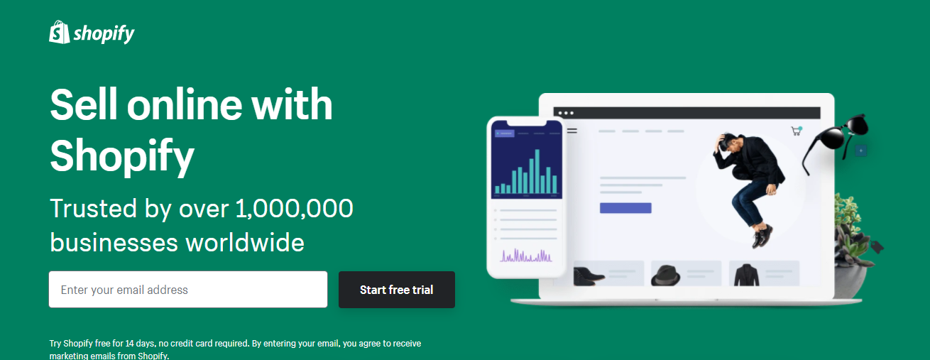
It is a very simple and elegant page. The page does not have huge paragraphs and conveys the message to its users easily. There are hardly any fields for you to fill out and this makes the entire process much simpler and easier for you to get the main point i.e selling with their tool.
2. Flickr
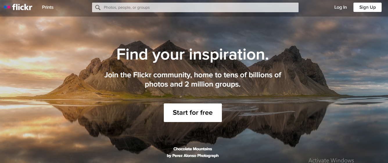
Flickr does an amazing job when it comes to their landing pages. With the hero images being changed every second maintaining the same headline, body copy, and the call to action it is one of the best-rooted landing pages. With the Sign-Up CTA reflected twice and the headline prevailing what exactly Flickr stands for it makes an outstanding page.
3. UpWork

Upwork is a platform that connects professionals and businesses from various areas. The landing page for freelance writers is a well-crafted piece of work. It has one CTA button to get started which is an appealing aesthetic altogether.
How to create a Landing Page?
Your landing page should be a sweet trade to your visitors. Don’t make it complicated and over-rated. It should not have unwanted bells and whistles that will distract your visitors.
In fact when you are about to design your landing page you need to think twice about what will make your visitors provide their name and email address on your page.
Let’s get into the glory of creating a landing page.
You can start exploring the various landing page builders that are available and choose the best tool as per your needs.
But how the heck do you choose one from so many options available?
I have shortlisted the best of the tools so that you can decide for yourself that will help you scale your business.
Landing Page Builders
1. ConvertKit
ConvertKit provides 18 designs and you can customize it with your own copy and visuals and make it more attractive. The major advantage of ConvertKit is that you can seamlessly integrate with your email list. Just with a few clicks you can tag, segment, and send deliverables to your email list. And all of this can be done in an autopilot mode.
2. InstaPage
InstaPage builder has built a reputation for creating sophisticated landing pages. Alongwith good templates they also provide A/B testing options. This helps you to have a clear picture to figure out which template and content will work best for your visitors. If you are looking for a focused and well-optimized page and make your campaigns turn into profits, then InstaPage will be a good choice for you.
3. Unbounce
If you are looking to convert more leads with your increased ad spend, then Unbounce landing page builder will be a good choice. They have good mobile-friendly landing page templates and also a huge array of sticky bar and pop up templates. You can customize the design from the 100 templates that they have each focusing on a singular goal.
4. LeadPages
LeadPages are much similar to Unbounce and their platform is very simple to use. LeadPages are also known for their mobile-friendly templates and also provide A/B testing within the platform. You can get easy access to your metrics on their analytics dashboard.
Once you have selected your tool to create a landing page you need to go ahead and create one with the landing page builder that you have chosen.
I have created a landing page with ConvertKit. You can have a look here at SEO Beginner’s Guide.
Pointers to be considered while creating a landing page
1. Select a template
To build my page, I chose Cedar Style from the list of available templates from ConvertKit while keeping the goal in my mind. I wanted to create a unique, simple design that would do the conversions for me.
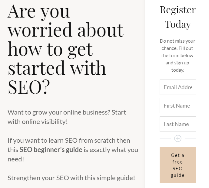
You need to select a template keeping in mind what is the motive of your landing page and what you are going to serve your visitors.
2. A Killer Headline
A headline is the starting point of where everything begins – interest, attention, and comprehension or understanding.
A headline will compel your visitor to stay and know more about what you are offering and what you are not. It should grab the reader’s attention. Try to keep the headline short, not more than 20 words would make a great headline.
Mailchimp does an excellent job with respect to headlines. The headline is short and sweet and summarizes its goal efficiently and spark’s the visitor’s interest.

3. Make Use of Pictures When Needed
Visual content or images are a vital component of landing pages that convert. The human mind processes images faster than a simple text. Hence the visitors will be more attracted to the images on your landing page.
When you chose an image and place your image keep in mind the following points:
- The image size should be visible but not too small or not too large.
- Select relevant images of your product or the service that you are offering.
- If you are selling a service, then the sole purpose of the image should be to grab the attention of your visitor.
- Choose high-quality images.
A good example here I can give is Shutterstock.

We all know that Shutterstock sells high-quality images, and hence their landing page also has good high-quality images. After all, who would buy images for their site from a company that does not showcase great ones on their own website? The answer is not many would do the needful.
4. Keep It Simple
A simple landing page will keep your visitors focused on the main call to action. It will help them to get rid of the unwanted visual clutter.
Dropbox is one of the examples that has a simple landing page that communicates volumes without many words being conveyed.
5. Provide a Clear Explanation
Your landing page has to give a clear explanation of what you are offering to your visitors. If your potential visitor does not have a clear picture of what is your product or your service that you are offering then there is a high probability that you will lose them. So you need to give a straightforward and clear explanation.
Slack gives the best clear explanation to its visitors explaining what it is exactly all about.

6. Do an A/B test
Once your landing page is ready and all setup, don’t just leave it there. You need to keep track of your metrics to see how well it is performing.
Are you getting the numbers right? I mean are you achieving the conversions that you expected? If not, then you need to figure out why your visitors are getting lost?
You need to gather data on your landing page’s performance by looking at heap maps, scroll maps to find out if there is any room for improvement. Then you can perform tests of your various design versions to have an idea which one performs better. By doing A/B tests, you are making sure that you get the best results for your traffic.
6. Call to Action Button Should be Kept Straightforward And Should be Powerful
A call-to-action button is the most important component of your landing page. I urge you not to mess with your call-to-action button. It should not stress out the visitor or confuse your reader. Make it clear and concise. It should be a simple yet effective one.
You can see that I have a simple call-to-action button: Get your Free SEO Guide.
It informs my visitors that if they click on this button they will be receiving a free guide on SEO. As simple as that!
7. Personalize Your Page So That It Is Unique to Your Brand
Personalizing your landing page will give your readers know more about you and build trust in you. This is somewhat like “Choose your own adventure”. For example, on my landing page, I have added my picture informing my readers about me and the services that I offer.

However, it’s completely your choice how you want your landing page to look like when it comes to personalization. All landing pages are not personalized but doing so can add more value to your brand.
Benefits of using a Landing Page
1. A Landing Page Helps to Increase Conversions
A landing page can increase your conversion rate to a great extent. They are freaking good at converting! Having a landing page that ties up into a certain exciting offer can encourage the new visitors to fill up their details in exchange for an immediate reward that they would receive.
For example, if you happen to land on a business website and you are immediately greeted with a form that asks for your name and email. Well, that’s a bit jarring to fill out before you even know what the company is all about, am I right?
On the other hand, now imagine that you land on a site that offers a free ebook on social media, which provides you almost 10 immediate solutions to your problems then I am sure that you are likely to provide your details for the valuable content, isn’t it?
As said, a landing page can help to increase your conversions and also help to provide a better user experience. It can also help to determine which type of content you need to serve to specific visitors so that you can build faster and more effective leads.
There are enormous companies that redirect their advertising, email, or even social media traffic to their homepage. There is nothing but a huge miss here. When you are aware of the fact that a specific stream of targeted traffic will be coming to your site, then you can simply increase the probability of converting that traffic into leads with the help of a well-targeted landing page.
For example for the visitors who convert on your social media ebook landing page, you can follow up with them with a help of personalized mail adding more additional content that you can provide which is related to social media as their interest is in social media.
2. A Landing Page Helps to Grow Your Email Subscriber List
By now I think it’s pretty clear to you what a landing page has to do. So basically you will ask your visitor’s their email and name in the exchange for the content that you offer. This can help you grow your email subscriber list at a faster rate and in return, you can provide more personalized follow-up emails to your subscribers.
The visitors who have filled your form in exchange for content or the product or the service that you provide, have basically shown an interest in your offer and this ensures that you have high-quality leads.
You need to think about how you will nurture them further. To do this you can send a kick-back thank you email once your visitors have downloaded your offer and also provide some additional resources related to your content.
3. A Landing Page Allows You to Measure the Metrics
If you have a specific landing page that showcases your new product or service then you can use that landing page to measure the metrics that are directly related to meet your business goals.
For example, if your marketing team’s job is to increase the sales for your email tool then your team can create a campaign with a landing page that can offer a free demo of your tool.
Then you can measure the conversion metric on that landing page to find out how well your campaign is performing. It can also help you understand the tweaks that you would need to make in your campaign to communicate the value of your new product or the services that you offer.
4. A Landing Page Increases Your Brand Value
A well-designed landing page can impress your visitors and ultimately convert them into your leads and leave a positive impact on your brand. It is not necessary that each visitor might immediately convert, but a well-designed landing page will surely increase your brand recognition and help you to nurture your future leads.
A landing page should never be a boring one. You need to give some time while creating a landing page, make it more interesting and interactive that will provide value to your brand.
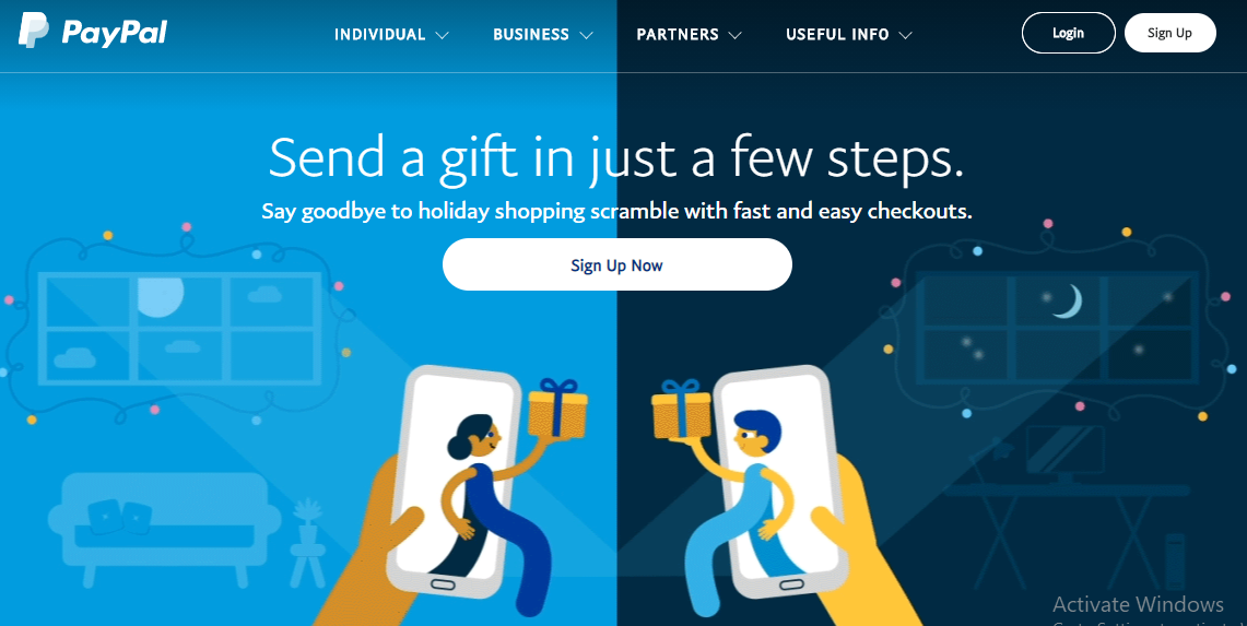
PayPal does an excellent job with it’s landing page. Have a look below. Isn’t it amazing?
5. A Landing Page Provides Additional Insights Into Your Target Audience
A Landing page can give you valuable insights into your audience’s interests. The data that you have collected using your landing page can be used to build a more targeted personalized marketing strategy.
Landing pages not only tell you which content your audience prefers but also informs you about the channels that they prefer. By knowing this, you can further promote and engage your content with your audience on the channel that they are already using.
Conclusion
A high converting landing page is all you need. If you own one, then it is the exact place where all your efforts come to fruition. It is the place where your visitors click, buy, and ultimately you earn revenue.
So please don’t try to mess it up!
Landing pages will help you to leverage the count of your new leads. I believe that with the help of various tweaks, additions and subtractions, various variations that you can implement there is no reason why you can’t create a landing page that converts well.
In this article, I have gone all over the nuts and bolts of landing pages and I hope will help you create a high-performing landing page. Fortunately, landing page creation is not rocket science and can be done easily by anyone keeping all the pointers in mind that are discussed in this article.
Do you use landing pages and what has your experience been like? Let me know in the comments section. I love to hear from you!

